Topping & Company Booksellers
Edinburgh | Conversion of substantial Georgian premises
Designed by W.H. Playfair in 1821, and an important element of his Calton Scheme for the Eastern New Town, this property had lay dormant for too long. Originally designed for residential use, and most recently housing a bank, we were delighted when Topping & Company Booksellers approached us regarding the conversion of the property.
Having previously worked with the client on the creation of their successful St Andrews bookshop we knew exactly the type of atmosphere they like to nurture. Visiting the property it was clear that there was the potential to create a very special place for the booklovers of Edinburgh.
- Survey of Existing Building
- Architectural Drawings & Signage Design
- Obtaining Planning Permission & Listed Building Consent
- Obtaining Building Warrant
- Liaising with relevant consultants
- Inspecting works on site
Revitalising a Playfair Classic within Edinburgh World Heritage Site
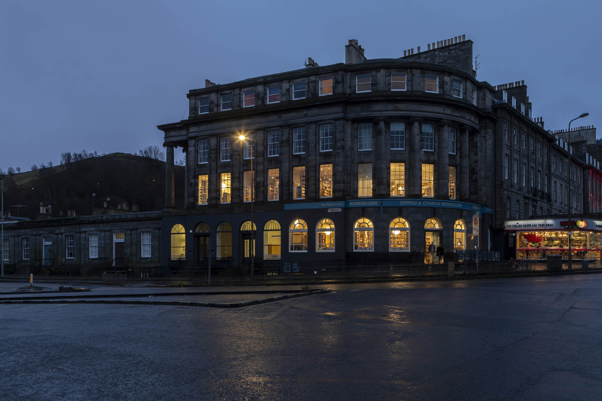
Positioned just below Calton Hill, 2 Blenheim Place is an impressive, curved tenement block designed by the renowned architect William Henry Playfair.
It plays an important part on the eastern fringes of the world heritage site, with a two storey Ionic portico to the east and a quadrant colonnade facing onto Leith Walk.
The architectural importance of the property would therefore necessitate a sensitive approach to its conversion.
Bank to Bookshop
Its time spent as a bank had seen the property become cluttered with commercial paraphernalia, air conditioning units, plastic trunking, suspended ceilings, meeting booths etc. This all detracted from the architectural splendour of the beautifully proportioned rooms.
Our aim was to strip away this mess and allow the rooms to be read as intended. This however had to be addressed while inserting as many bookcases as possible for our client.
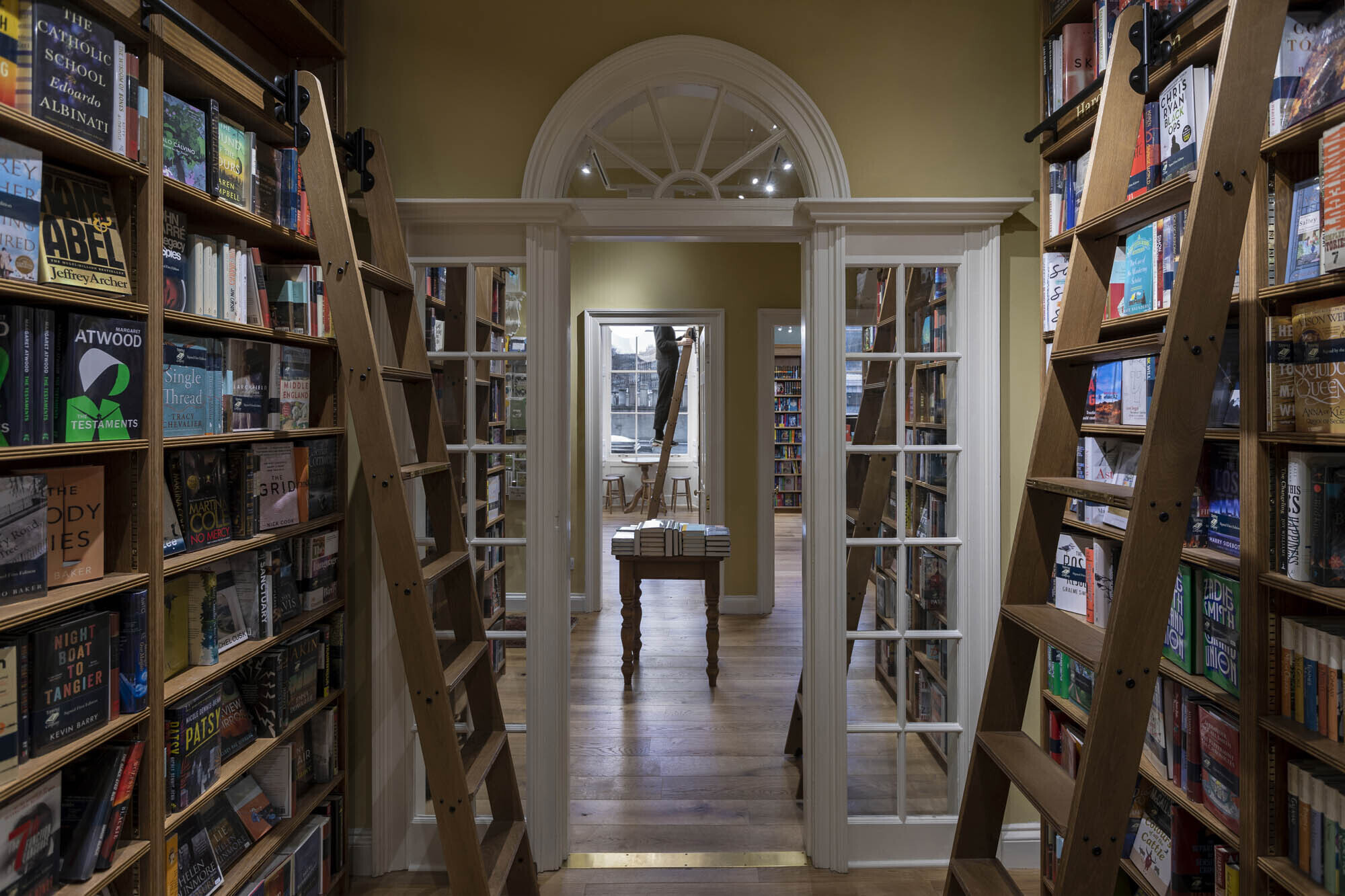
This was done by carefully crafting the bookcases around existing skirtings and sticking as close to the symmetry of the rooms as possible.
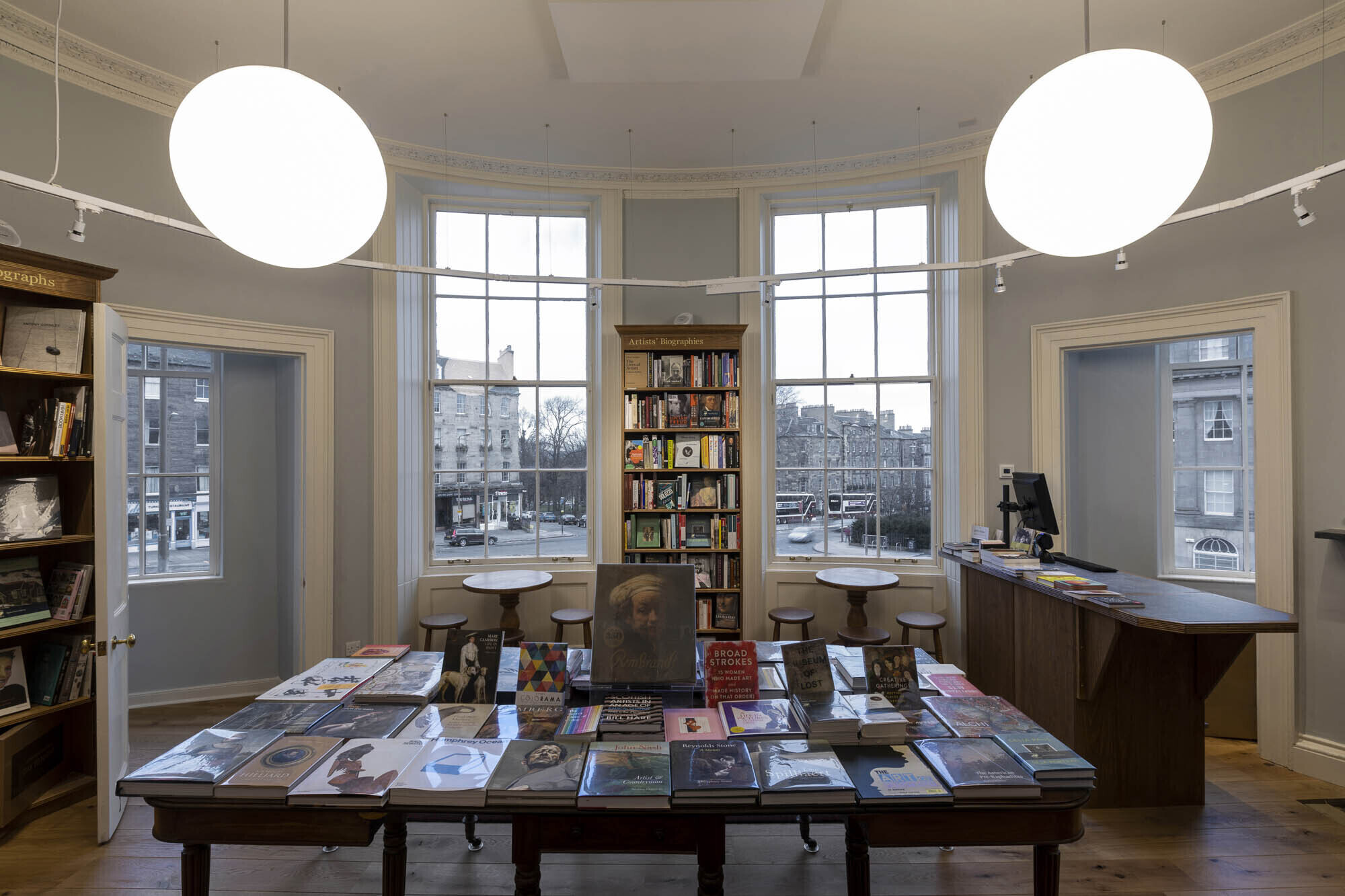
A particular triumph is the oval room on the first floor where the art section is housed in beautifully curved bookcases.
Retrofitting for accessibility
One of the most substantial interventions undertaken during the project was the insertion of a lift. Firstly, a suitable location had to be decided in order not to ruin any of the main rooms and secondly it needed to work for the circulation of customers around the shop.
Fortunately, an area to the rear of the property had been significantly altered during its time as a bank, but unfortunately this is where the bank vault was also located.
This led to some intricate structural design and hefty construction work as the contractor broke through and removed sections of the reinforced concrete safe. It was however all worthwhile and the first floor is now accessible to all for the first time.
Kerb Appeal
We were confident that our plans to turn the vacant property into a bookshop would be well received by the local authority, but we were still keen to make sure that the redevelopment made a positive contribution to the local streetscape.
At ground floor level the building had previously been split into two with the neighbouring property housing offices. The external walls of the offices had been painted in a dark grey with the project site a mix of light grey to the north and granite cladding to the quadrant facing Leith Walk. Our clients quite rightly wanted the external façade to attract as much attention as possible to passers-by. Through a series of photomontages, we were able to convince them that the use of traditional signage would be enough and that the light grey areas to the north would be better if they closely matched the neighbouring property.
This allowed the building to be read as a whole once more, albeit the first floor band course was picked out in the bookshop colours.
Signage
The area surrounding the bookshop has a plethora of plastic signage adorning mainly historic buildings. It was our intention to provide an example of good practice by putting back a traditional hand-painted sign. We wished to pick out the carved street name on the first floor band course which left little room for the shop name in this location.
Therefore, in order to address potential customers walking up London Road, we decided to design some hanging signs, the brackets for which were selected to imitate the railings at the front door of the shop. The result is a façade that looks like it has always been there.
A Place to Browse
Having enticed customers to enter the shop with the lure of books visible through the windows, it was important to create the right atmosphere to keep them there. Toppings do a great job of that themselves with their great enthusiasm for books and their offer of free tea or coffee. The use of oak on the bookshelves and the re-clad stair helps to create a sense of warmth especially on a cold Edinburgh evening.
The warren of books designed to allow you to find a cosy nook to sample a chapter or always feel there is one more shelf to browse. If comments on social media are anything to go on then Toppings is a very welcome addition to the UNESCO’s first City of Literature.
Project credits & thanks
- Client: Topping & Company Booksellers
- Main Contractor: James Normand & Son
- Lighting Consultant: Terkan Lighting Specialists
- Structural Engineers: Dryburgh Associates Limited
Photography credits
- Angus Bremner
- Harry Taylor & Co (on site / work-in-progress photography)
Filed in:


